More coverage of the 2017 DC Design House here.
SOMETIMES THE OBVIOUS doesn’t hit you until afterward. The one thing most of the designers at the 10th annual DC Design House had to contend with was . . . wait for it . . . enormous rooms. As in wide open spaces.
Such a problem, I intone, huddled in my 15-by-30 living AND dining room. And yet I have to admit that the situation was a challenge requiring just as many solutions as small rooms do.
(This is in addition to the challenge of coming up with realistic names for some two dozen rooms. A decorator show house cannot have five living rooms, which is where we get the Study in Blue and the Study Royale and the Lady’s Retreat and the Collector’s Cabinet and the Upstairs Family Room and the Idealized Family Room and the Little Jewel Box Sitting Room and the Travelers’ Retreat. You get the idea: too much of a good thing.)
So here are a few examples of the design challenges that faced the designers. The Design House is open through October 29 (except Mondays), and tickets cost $35, the proceeds benefiting Children’s National Health System.
—Nancy McKeon
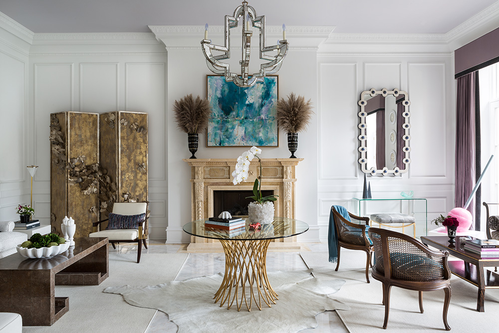
The Living Room, by Margery Wedderburn and Melanie Hansen of Margery Wedderburn Interiors of Great Falls, Virginia. / Photo by Angie Seckinger.
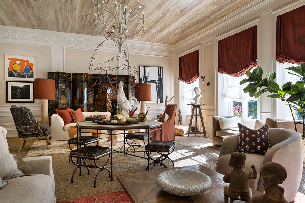
The Collector’s Cabinet, by Josh Hildreth of Josh Hildreth Interiors of Reston, Virginia. / Photo by Angie Seckinger.
The Living Room and the Collector’s Cabinet are both big, honking rooms, the Cabinet being the larger of the two. Both have tall ceilings, making the rooms seem that much bigger, and lots of natural light, which helps.
Both Josh Hildreth of the Cabinet and Margery Wedderburn and Melanie Hansen of the Living Room essentially divided their spaces in half. Anchoring the halves is a center table; Hildreth’s custom table was hand-hammered in the French forge of Ironware International.
Both designers visually brought the ceiling down to human scale with a central hanging light fixture; Hildreth also had the ceiling hand-painted to resemble planks of pecky cypress. After that, it was “simply” a matter of creating two seating areas in each room. The results are quite different (after all, one of the rooms does not have a giant pink lollipop sculpture in the corner), but the guiding principles are quite similar.
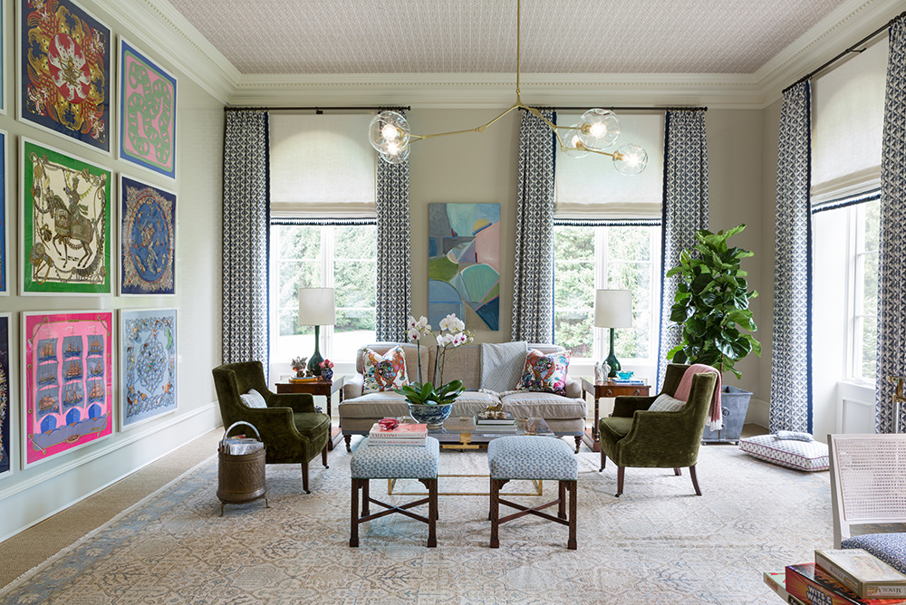
The Lady’s Retreat, by Marika Meyer Interiors of Bethesda, Maryland. / Photo by Angie Seckinger.
The famous Hermès scarf is three feet square, so imagine a wall that can accommodate three of them framed and stacked, with room to spare. That’s what anchors the Lady’s Retreat, that and several oversize windows and a ceiling brought lower visually by means of hand-printed fabric. With the perimeter thus defined, the seating area could be allowed to float; sofa and chairs are ample but not overly so. Now take a deep breath.
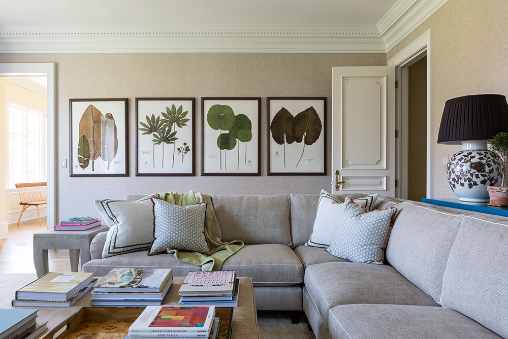
The Upstairs Family Room, by Erica Burns Interiors of Bethesda, Maryland. / Photo by Angie Seckinger.
Giant botanical specimens were another way to use oversize art to wrestle a large room to the ground. The framed tropical plants in the Upstairs Family Room came from Sweetgrass Botanicals of Winston Salem, North Carolina, which also custom-presses wedding bouquets or just the moonflowers from your backyard trellis.
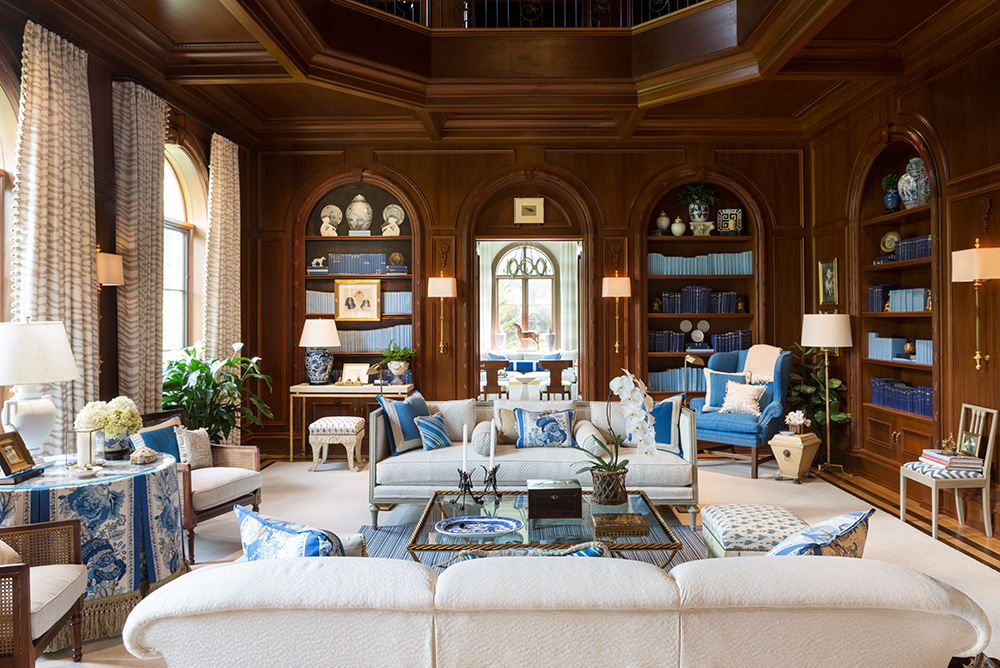
A Study in Blue, by Kelley Proxmire of Bethesda, Maryland. / Photo by Angie Seckinger.
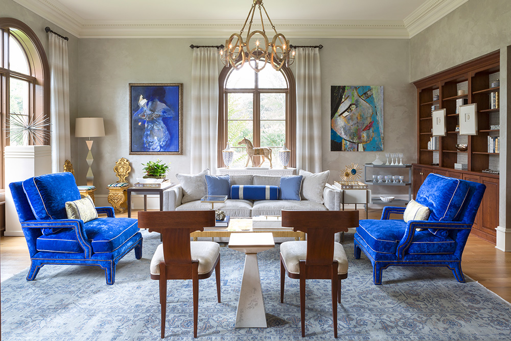
The Study Royale, by Lorna Gross Interior Design of Bethesda, Maryland. / Photo by Angie Seckinger.
You can get a glimpse of the Study Royale by Lorna Gross through the double doors of Kelley Proxmire’s Study in Blue. So the theme color of the rooms was known to both designers, helping the home flow the way an ideal one would.
Proxmire’s library was “contained” by the existing wood paneling and bookshelves and the dramatic ceiling above. So she was able to establish a central seating area, then add additional chairs and tables around the periphery of the room. An assistant actually hand-painted the spines of all the books in several shades of blue. But the bookcase between the window and the doorway was a flat, paneled shape, there for symmetry. Proxmire’s solution: She had the “bookcase” decked out with books and bibelots, all painted on a canvas and fitted into the space.
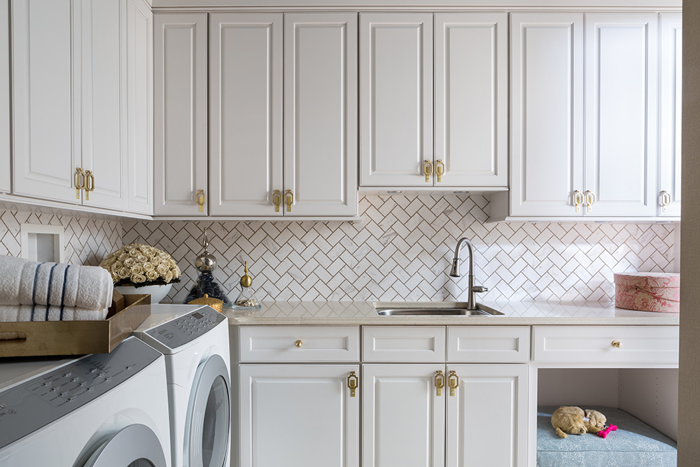
The Lush Laundry Room, by Paula Grace Designs of Ashburn, Virginia. / Photo by Angie Seckinger.
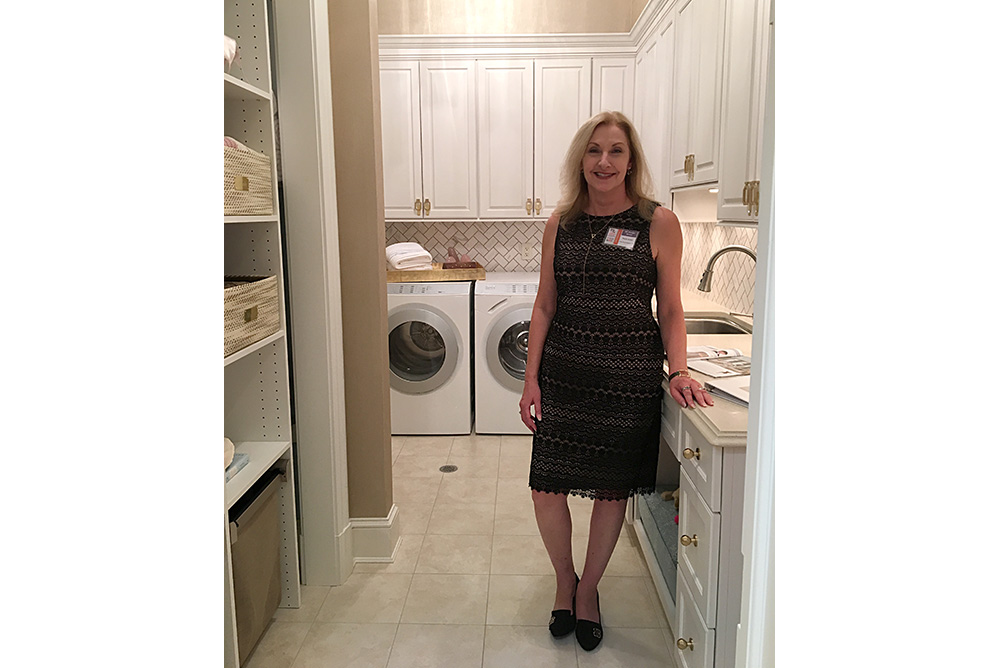
Designer Paula Grace Halewski of Paula Grace Designs of Ashburn, Virginia, stands in her Lush Laundry Room. / MyLittleBird photo.
Can a laundry room be sexy? Apparently so! Witness the Lush Laundry Room. I swear I’d be better groomed, and fluffed and folded, if I had even half the space—and orderliness—of Paula Grace Halewski’s behind-the-scenes room. Like many laundry areas, this one has no natural light, so Halewski gave it a sky-blue ceiling. (Actually, like all the paints in the house, it is from Sherwin-Williams—Sleepy Hollow, SW9145.) Shimmery wallpaper above the cabinets helps bounce around the light furnished by a sparkly ceiling fixture, not shown.
