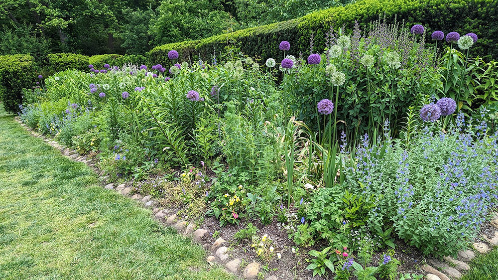
One of the mixed borders at Dumbarton Oaks in Washington DC. / Photo by Stephanie Cavanaugh. / On the front: giant alliums. iStock photo.
By Stephanie Cavanaugh
BIKINIS IN JANUARY have never made sense to me. I have zero interest in summer clothing (cruise wear—is
it still called that?) when I’m hunkered down in down.
On the other hand, it makes total sense to focus on gardens in January, though digging and planting and mulching are months away. There’s so much planning to do, much of it misbegotten—but there’s plenty of time for revisions before you make real (read: expensive) mistakes.
Ah . . . daydreaming about roses and such is so lovely when you’re sitting in front of a fireplace, or a TV set displaying a video of a fireplace. Magazines that feature gardens: elegant, cottagey, one color, 100 colors . . . Rev those gray cells for spring!
Beginning in January, we anticipated a glut of gardening in the pages of top design magazines like House Beautiful, Architectural Digest (AD), and Elle Décor. Alas, months passed, warm weather approached, the fingers itched for dirt, the brain for inspiration, and there was little to be found. Even magazines dedicated to gardening, such as Flower, were focused on table settings and flower arrangements.
So, June springs forth and what do we have? A whole lot of interiors painted beige. Beige, see, appears to be the new gray. Not only are there no flowers or gardens in these magazines, there’s little color. The words austere and boring come to mind.
Thank god for RuPaul’s shoe collection in AD, a two-page symphony of hot pink, hot red, cool turquoise, and metallic gold. All with spike heels and platform soles to give his 6’4” frame a lift.
In a break from beige, RuPaul’s house is mostly white walls and black trim with bursts of primary colors in the furnishings. I could live here.
But where’s the garden? Maybe there isn’t one. No, in a photo of the pool (white walls, black and white cushions) a landscape architect is credited, though there’s nothing to be seen of his work besides some greenery sprawled over a wall. Nice pool, though.
Though they do a fine job of covering gardens online, Veranda alone nods to the season with a flower-filled solarium on the May/June cover of the magazine, and a handful of features that include short takes on exceptional spreads—great ideas for those who happen to have, for instance, 250-foot borders flanking the path to the chateau.
There are also several gardens that feature a pleasing eclecticism, mixing formal and informal plantings, such as the prairie garden in England that features a mix of ornamental grasses and wildflowers. Another idea: keeping plantings neat and orderly near the house and increasingly loose and wild as you approach the forest. This does hinge on having a forest.
Then there’s a pet peeve of a trend which I’m happy to see so I can rail about it. Ceramic sculptures that climb walls. The spread in Veranda features branches of foxgloves, poppies, hyacinth and such. Created by London-based artist Kaori Tatebayashi, these are “precisely wrought” replicas in “ethereal unglazed white stoneware.” They’re intended to cover a wall, like 3-D wallpaper.
Imagine the dust! The ick! How do you clean them?
On the other hand, it won’t be long until they’re beige.
