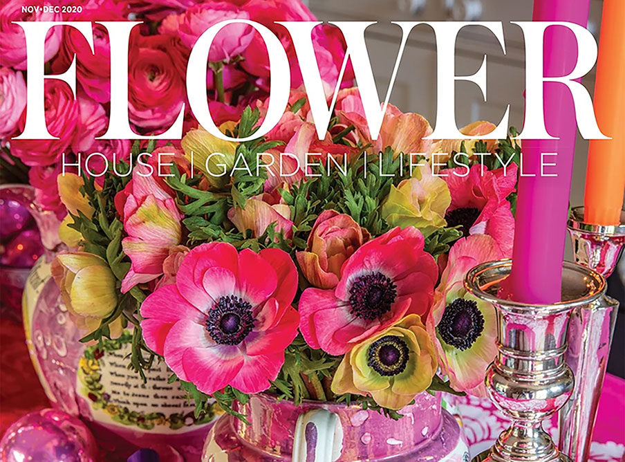
Cover detail of the November-December 2020 issue of Flower magazine.
INTERIOR DESIGNERS think about “layers” when creating a room. There’s the floor covering (or not), the walls papered or painted, the windows shaded or draped, then furniture cushy or sleek, and finally the tchotchkes that give the room texture, personality, interest, charm and (we hope) wit.
Some consider books an accessory layer, like those who buy books-by-the-yard in the hope of looking more intellectual but don’t actually read them. Fie on you if you don’t—though it’s certainly so that a room without them feels like a room devoid of brains. Consider the talking heads on TV in this time of Covid. They pose in front of their bookcases in demonstration of their bona fides. I’m an intellect, those books say, my opinions are worthy of respect. (This is even as books become dust traps as we move on to e-readers such as Kindle, so much lighter to schlep about and so much easier on arthritic fingers).
Well. That was certainly an elitist hissy fit if ever I wrote one. And beside the point, which I’m getting to . . .
Flowers and plants add another layer to a room. They’re not exactly inanimate, though many are certainly ephemeral. They are the sugar and spice that bring a space alive.
Flip through any shelter magazine and consider the rooms with and without blooms and greenery. What warmth they add—and if employed particularly well, they also provide an extra frisson of pleasure. It’s as if the space had burst into a fourth dimension.
On the November-December cover of Flower magazine, the dining table is covered with a pink-and-white-flowered cloth. There are pink and white and green flowered plates, with a centerpiece of mismatched pink and white and green Lusterware jugs and cups exploding with pink and white and green anemones, shiny bits and baubles echo the color, and silver candlesticks reflect it. That’s a Mad Hatter’s tea party I’d be happy to attend.
A black-and-white kitchen in this month’s Veranda magazine features a wall-length, five-panel black mirror, one end chinoiserie-painted with white dogwood blossoms. Set on the opposite end of an island in front of the wall, a large silver Revere bowl with an extravagant display of forsythia, arranged so it seems as if a strong wind is blowing, the flowers stretching toward the dogwood in a grand gesture. While about a third of the work surface is obliterated, it sure looks spectacular. And how cold, flat and heavy the space would be without the flowers.
Another page, a small picture of a dressing room, has a lush painted vine twining around near the ceiling. In the room’s center, a mirrored pedestal holds a silvery vase of what might be orchids—an extravagant display, so tall the flowers tickle the ceiling, seeming to mingle with the wall art.
Flip through any shelter magazine and find me a room that doesn’t benefit from the addition of plant life. A small tree in front of a window where the view outside is green accomplishes this without much fuss. A vase stuffed with flowers that echo the colors in a picture does this as well.
It’s trompe-l’oeil realized, a playful optical illusion where the tangible steps out from the inanimate, going beyond an optical illusion of depth, which is what the painted form of the art provides, but into living visual complexity—and delight.
—Stephanie Cavanaugh
LittleBird “Stephanie Gardens” loves plant life in all seasons, perhaps no more so than in this bleak season of Covid-19.