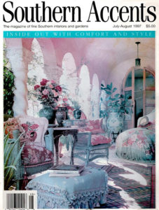
IF YOU SQUINT you may be able to see the date on the cover of this issue of Southern Accents magazine: July-August 1997. You’ll also notice (if you squint even harder) the thumb-tack holes and blackening in the margins where it has been alternately pinned and taped to walls and cork boards for almost 19 years.
This is Example “A” of something I want in my life but will never have, though I attempt to come close, in my higgledy-piggledy way.
Throughout the day, the sight of it in the corner of my eye energizes my fantasies. I crawl in and wonder: What’s beyond the arches, where the sunlight is so brilliant? It’s a garden, I think, deeply green, with a circular pool and a fountain. I can hear the gentle splashing from where I’m flopped on the settee, feet up on the flowered hassock with its deep turquoise fringe, my eyelids drooping over a book, probably something involving serial killers or clowns in sewers.
We don’t want to get too sappy now, do we? Like a sweetly decayed whiff of jasmine, a splash of sour is essential—like a touch of anchovy in the mozzarella in carozza (too often missing from restaurant offerings, I note in an aside).
Those “off” flavors are always what move a space from lovely to divine, be it garden or house. Or dinner plate, come to think of it.
Elder artists recognized that sour spice, reminders that death is always around the corner, a blink away. Like “the Vanitas theme in still life,” says my friend Sarah, a pre-Raphaelite beauty with tangles of red hair who always seems to rattle some deeper message in what I often consider my blather. “This always fascinated me in Art History—the inclusion of decaying fruit, or skulls or bugs in gorgeous, lush paintings of flowers.”
The jarring notes in this magazine picture are almost hidden: the raw, unfinished look of the doors to (presumably) the house; the dagger-sharp points on the chandelier, a guillotine above the rosebush. In the foreground, lashing out from the left corner, the needle-whiskered tongues of a cactus twisting toward the fatly innocent elbow of whoever is hefting a martini in that flowerfully cushioned wicker chair.
Those little threats are what make this room so tasty, that make me curl my toes. Observe how they contradict the almost overwhelming sweetness of the candy colorations, of the floral fabrics that cover the furniture, toss pillows and silken shawl. How they offset the ticklish fringes and tassels and the heady scent of full-blown roses in pink and vermilion.
Notice how they quietly call attention to textures that sit on a wobbly edge of discomfort: the brittle smoothness of the wicker, the slightly scratchy coarseness of the needlepoint pillows, the pebble finish of the strawberry-sherbet stucco walls, the ceiling that vaults and then melts into the columns’ massive Corinthian capitals, which in turn flow into curvaceous fluted shafts twisting to the floor like fat Edenic snakes.
NOTE TO MY PRINCE (AND POSSIBLY YOURS): The juxtaposition of beauty and beast must be deliberate to properly charm. Not that I assess any blame but the mess of rusty tools and cracked pots under the back porch does not qualify, nor the broken tile in the bathroom, or the various fixtures without lights, or the cockeyed iron thing that theoretically hides the kitchen fan duct, or, oh lord, the garage. . . .
—Stephanie Cavanaugh
LittleBird Stephanie is at work on a book about city gardening. You can read her previous columns by typing Green Acre in the Search box at the top right of the page.
