See It Now: Robert Irwin at DC’s Hirshhorn
ON A WEDNESDAY afternoon, the Hirshhorn Museum — Smithsonian’s museum of modern and contemporary art — is definitely not empty, but it’s somewhere in that vicinity. The simple, circular building stands out among the sea of neo-classical facades, but visitors are often drawn to bigger names like the National Gallery, or the Hirshhorn’s neighbor, the Air and Space Museum. And of those who make it inside, many are daunted by the idea of art that they just don’t get. I overheard one couple inside the museum, exiting a room of the permanent collection. Once safely out of earshot of the guard, the woman asked in a low voice, “Is this doing anything for you?” The man answered loudly, not sharing her fear of being overheard: “Nah. I’m not really a modern art guy.”
I can see where he’s coming from. A lot of modern art can seem impenetrable, inane or just grotesque. There’s plenty of it, even within the Hirshhorn, that I flat out dislike. But part of the wonder of modern art is that it cannot be reduced to a label. If you say you’re “not a renaissance art guy,” you’re referring to a specific style of paintings, frescoes and marble sculpture. Sure, I may force you to sit in front of Botticelli’s “Birth of Venus” for however long it takes to change your mind, but it’s your opinion. But waving off something as diverse and nebulous as modern art (a label that has emerged into our cultural vernacular without any coherent definition; only the vague connotation of a Pollock splatter painting) is just self-sabotage. Modern art takes all the rules that have been broken in the history of art, splinters them into smaller pieces, then stomps on them. And at the Hirshhorn, all those pieces create an experience that is equal parts exciting, confusing and captivating.
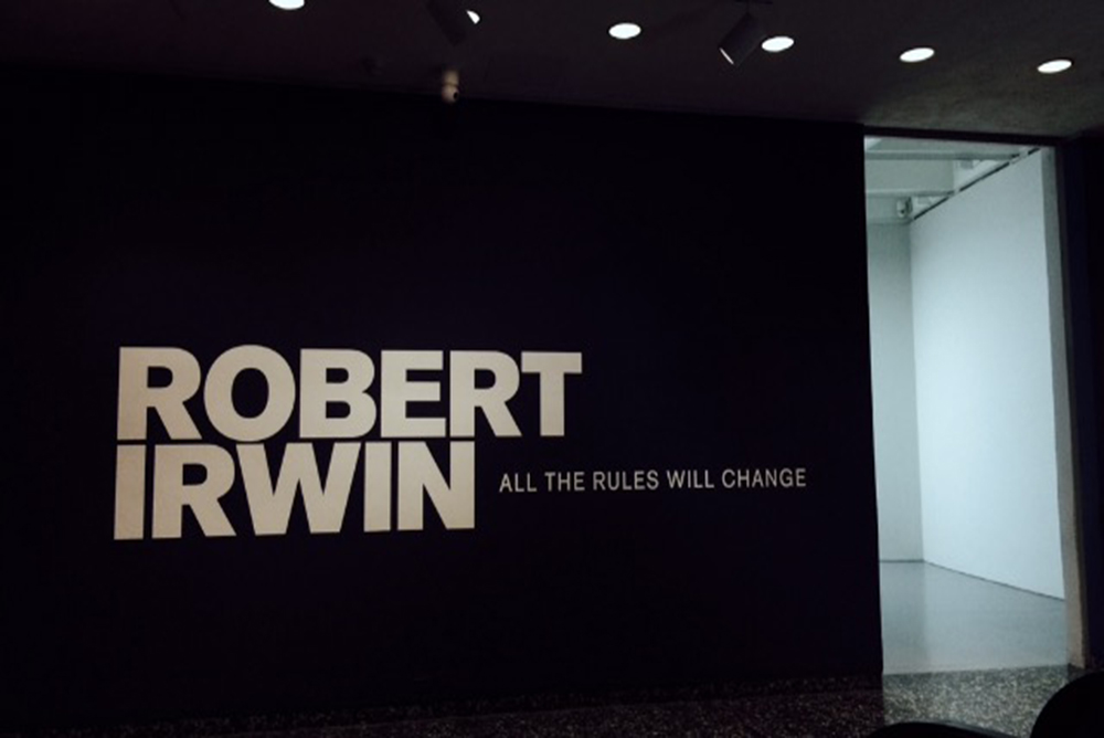
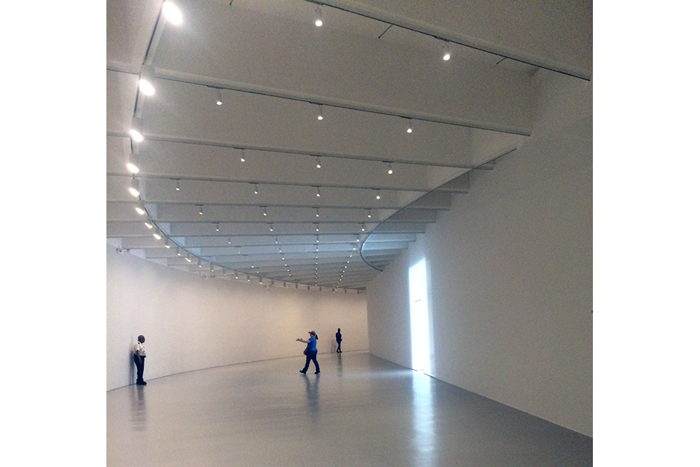
Which brings us to the Hirshhorn’s current special exhibit, “Robert Irwin: All the Rules will Change,” on view until September 5th. Stepping into the show feels like entering another world. It opens with a white room, its soft glow luring visitors past the dark walls announcing the exhibit. Perhaps the first rule to be thrown out is that of standard museum display—eye-level rows of paintings in ornate frames along the walls. In the Irwin show, wall space is used sparingly. Only one section features more than one piece per wall. Expanses of blank white make up identical walls that partition the long, circular gallery into sections. It all feels less like a museum and more like some vision of the afterlife, with perhaps a hint of an insane asylum. But a hallmark of the show is how the surrounding space interacts with and becomes part of the art. The stark rooms left me unmoored, with only the art itself to grab onto.
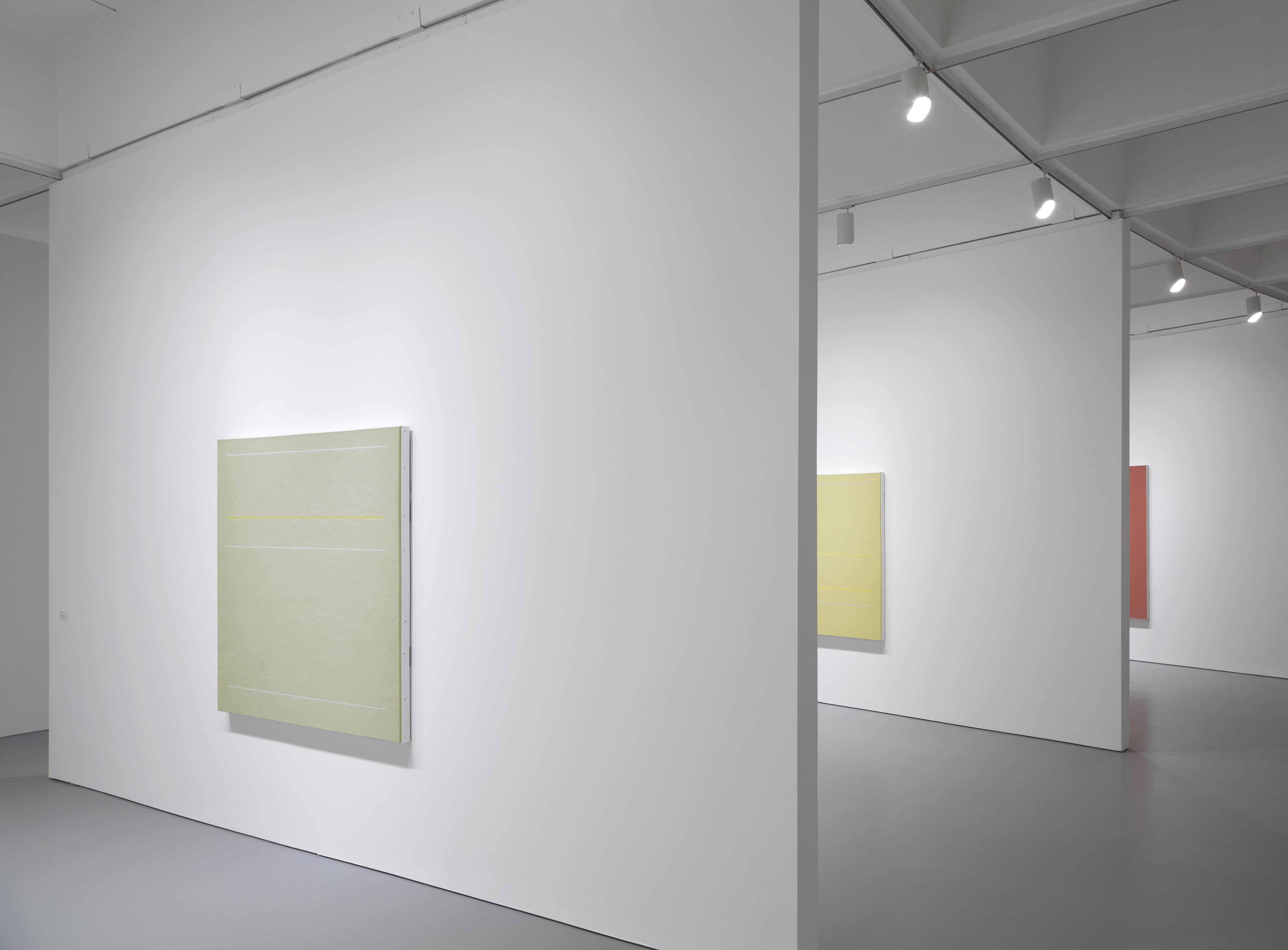
Two bays feature Irwin’s dot paintings. From afar they look like blank canvases. Stepping closer, they flourish into a field of colored dots. Stepping back, a blurred impression of the color remains visible. The effect is like staring at a bright light, and then looking at a blank wall. It is ephemeral and endlessly interesting, and if you didn’t stop to look closer, you would miss it entirely. Many do. Josephine Neulen, a gallery attendant, describes this as a frequent occurrence. “People will walk right past it and assume it’s blank,” she said. “They’ll come up and ask me ‘What is this doing here?’ and all I can say is, ‘Well, did you look at it?’” Irwin’s art requires interaction from its viewers, but it rewards them for their efforts.
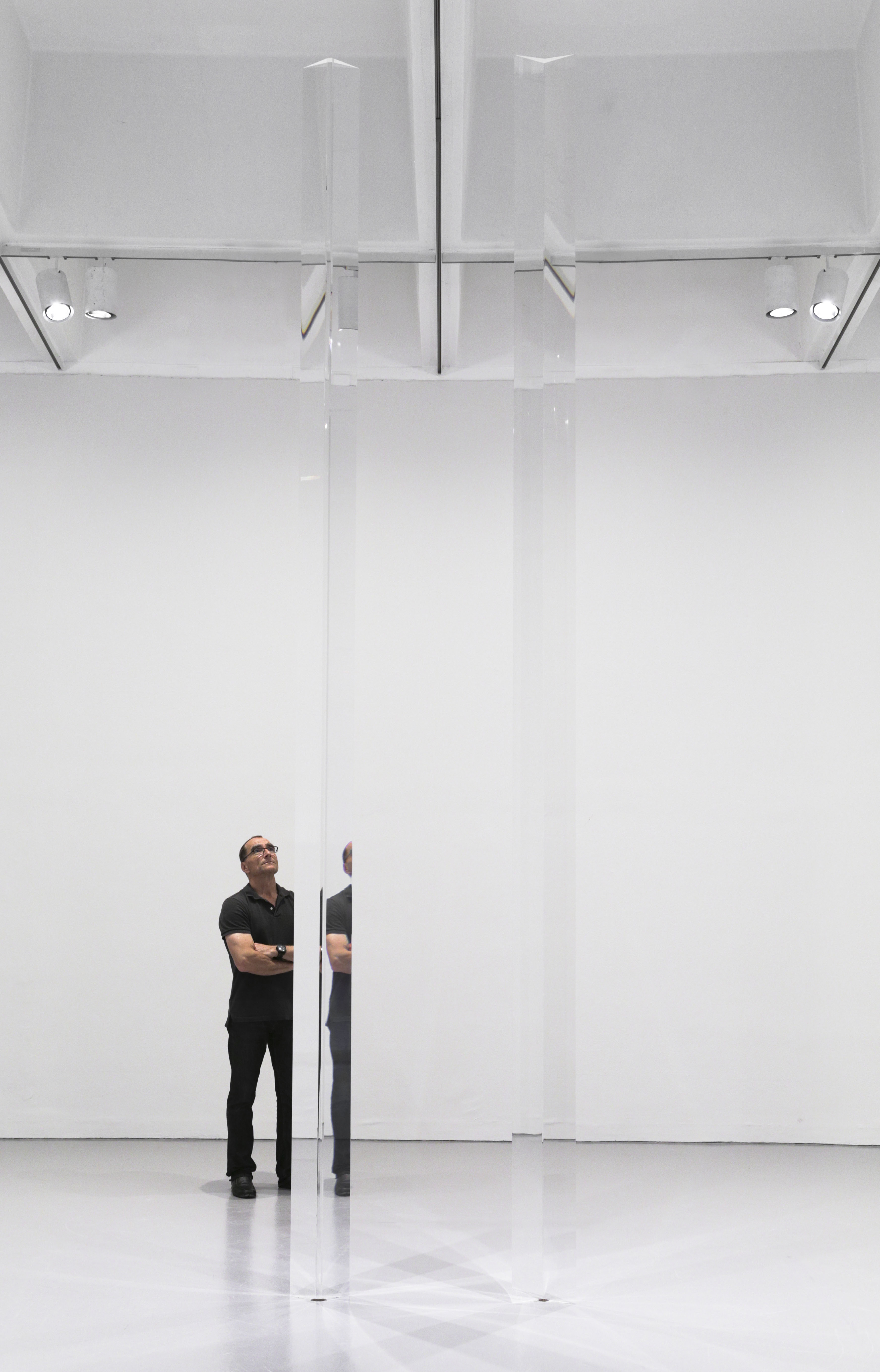
In one room, two acrylic columns stand parallel to each other, stretching from floor to ceiling. As you move around them, they actually change their surroundings, reflecting and refracting images through their prisms. Other visitors are doubled or erased depending on the angle at which you view them. As you look, it’s increasingly difficult to pin down the columns’ exact dimensions. They inhabit an ever-shifting space, with their environment caught within.
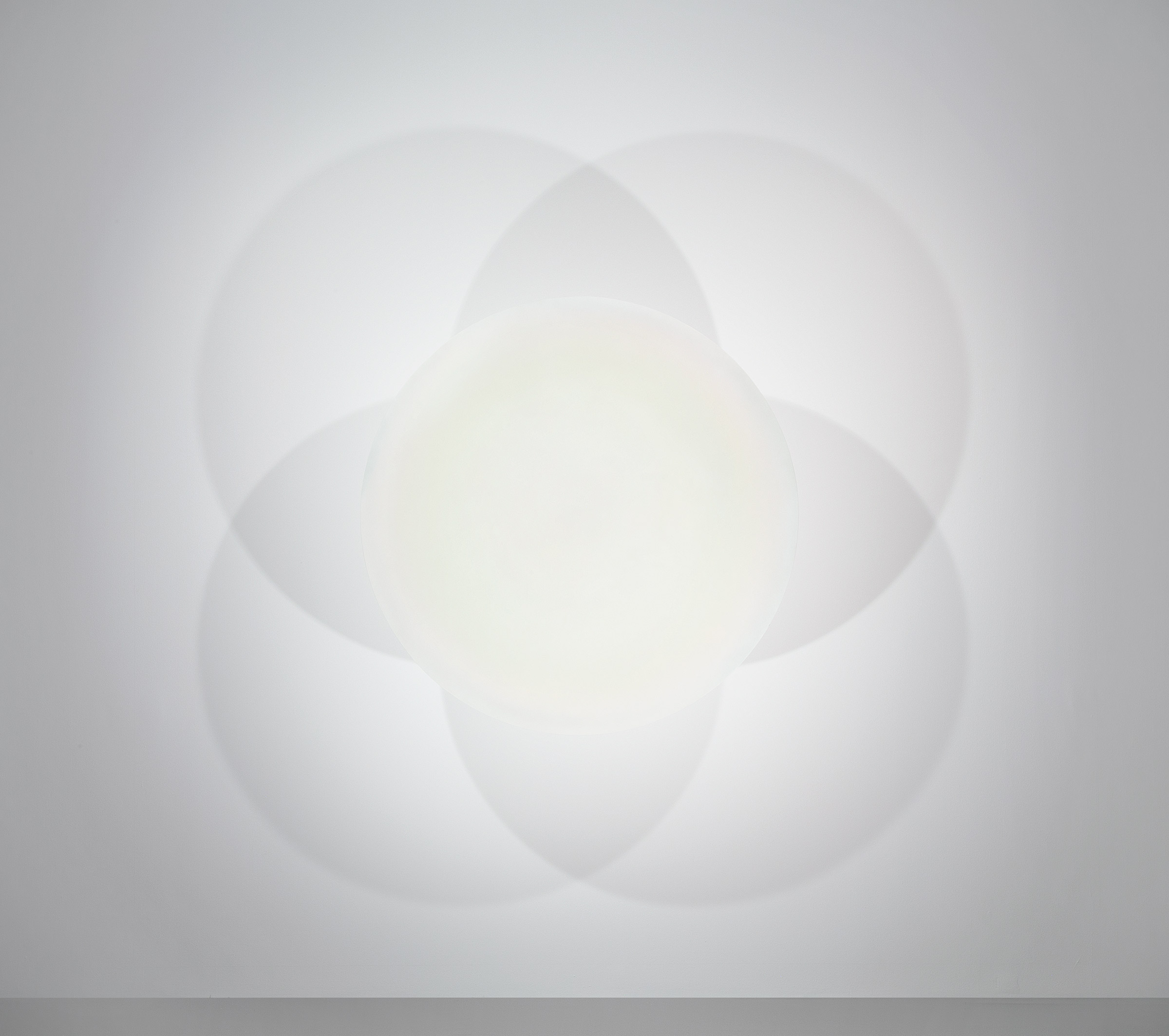
Past this room, a glowing disk seems to float on the wall, with spotlights casting shadows that overlap in a clover design. Irwin transforms the wall into a canvas of sorts—his specially designed lights a paintbrush that works in shadows. The line where the piece of art stops becomes hazy in the same way the opacity of the painted aluminum disk shifts along its edges.
In the last section of the exhibit, the room and the art actually become one. A screen of scrim “straightens” the edge of the curved room. Like the dot paintings, this piece often gets passed over. The museum includes standing signs warning visitors with the following message: “In the next room, your perceptions will be challenged. For this reason, we ask that you touch nothing. It is very important that you experience the exhibition with your eyes.” If you do, you’ll see the fabric slip in and out of reality, see the room reshape itself time and time again. To me, Irwin’s appeal lies in his ability to infuse static materials with a near hallucinogenic sense of movement and transformation. I will freely admit — I didn’t “get” all of this art. I looked at it, and I thought about it, I looked some more. And I supremely enjoyed it. For those who are intimidated or just fed up with art that keeps its cards close to its chest, know that this — the looking — can be enough.
— Emily Harburg is a summer intern at MyLittleBird. Her most recent post was on the National Zoo’s Washed Ashore exhibit.
