Super Women: Tricia Huntley at Home
PEOPLE SOMETIMES IMAGINE that interior designers are constantly rearranging their furniture, changing light fixtures, tearing up the carpeting. Not so designer Tricia Huntley, who Iives in a mid-century modern house in Northwest Washington.”Once you’ve solved a problem, once you get things right,” she says, “you don’t have to keep changing things around.”
Which doesn’t for a second mean she isn’t constantly busy–first with clients’ projects, of course, but also at home. Like most houses when we move into them, her 1955 place is a work in progress, projects attacked as time and money allow. And in fact she does change things. Her living room furniture is all at right angles now, a change from a year ago, when everything was on the diagonal. And she rotates her accessories, putting some in a storage room and pulling out others, because “after a while, you don’t ‘see’ them anymore.”
The last time we were here, Huntley kept the door to the small, interior 1970s kitchen closed. This time the door is open but still she says, “Oh, don’t look in there–it’s horrible.” Well, okay, it’s not a trophy kitchen, gleaming with granite and stainless steel (aren’t we tired of that yet?), but it has all its functioning parts, so why stress out about the least-important space in this particular house?
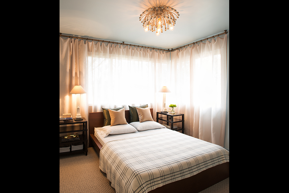
Instead, Huntley turned her attention to the main-level guest bedroom, painting it a pale blue, which she isn’t always so fond of–“but so many people love blue, that’s why I did it.” And because it’s on the main level–even though she’s surrounded by lawns and shrubbery–she curtained the window walls with sheers that let light in but keep prying eyes out.
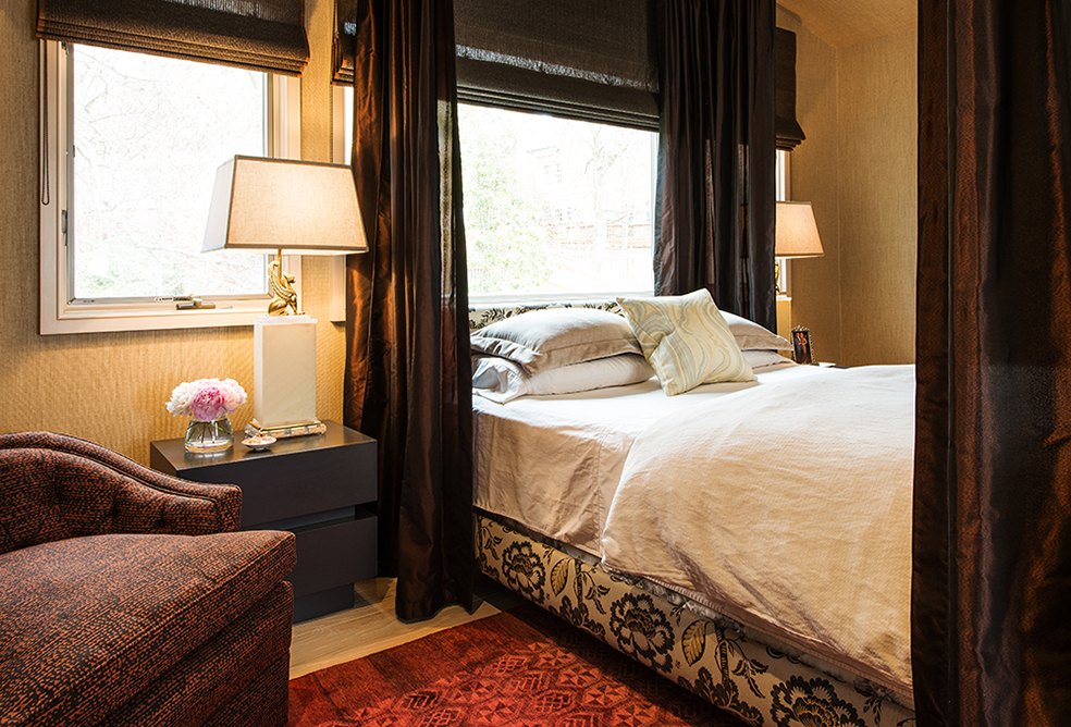
Her own bedroom upstairs is a different story. “I think a bedroom is for sex and sleeping, and so it should be dark and sensuous,” she explains. “I don’t understand all those all-white bedrooms.”
True to her word, Huntley has lined the walls of her bedroom in grasscloth, including the ceiling. She placed the head of the bed directly under the room’s main window, using it, in effect, as a headboard. “Last week,” she says in mid-April, “the window was all cherry blossoms” from the tree just outside. It still gives the room a fair slice of sky and greenery–but at night would be a deep, dark background to the room’s moody decor. At four corners of the bed, dark diaphanous curtains rise almost to the ceiling, further making the bed the star of the room.
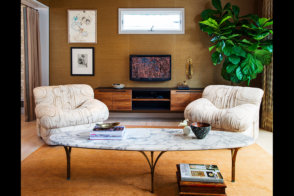
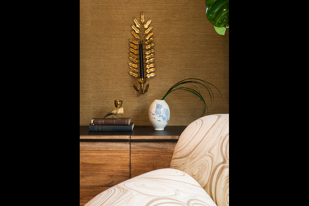
Huntley’s love affair with grasscloth continues downstairs in the TV room, which sits behind the dining room. Whereas the living room–at the front of the house and almost all floor-to-ceiling windows–is light and airy, the TV room is cozy. Grasscloth once again lines walls and ceiling–going for that “jewel-box thing,” she says. The chairs are upholstered in a crisp-looking fabric, but the fabric’s pattern reinforces their chubby silhouette. Accents in the room are modern . . . ish. Is the goldtone fern-shape sconce climbing one wall brand new? 1950s Italian? Maybe we’re not supposed to know.
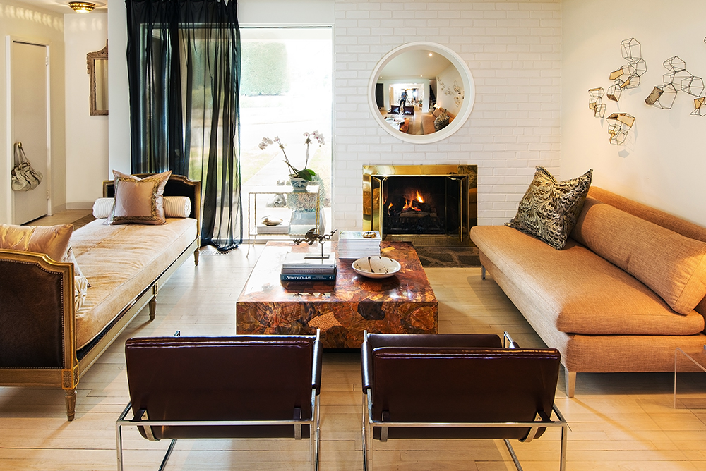
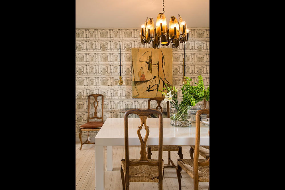
Huntley’s eye for proportion, her ability to mix a Brutalist chandelier with Queen Anne chairs in the dining room, a Louis XVI daybed with mid-century-modern chairs and a Brutalist-period coffee table in the living room–these are things that probably can be learned, but over time and with study. There’s no real template for the kind of mixing she does. (If you don’t know the Brutalist style, picture the Lauinger Library at Georgetown University or the FBI J. Edgar Hoover Building downtown–a lotta concrete, not prettified.)
But there are other challenges in houses that really do suggest that interior decoration has rules. Such as? Well, one reason modern rooms tend to be painted all white is that there’s no crown molding to frame the wall color and the ceiling color. “Having two paints meet like that”–Huntley butts the sides of her hands together and sighs. “There are reasons for things. Knowing the reasons for things [such as the role of crown molding or wood casings around doorways] helps guide your decisions.”
Which explains why Huntley’s hall and stairway are not yet painted. When deciding to paint an area in a color, she explains, “you have to have a stopping point.” So now she needs to decide on how to case the stairway, which, of course, in this open floor plan, is visible from the entryway and the living room.
And so it goes. Once she solves the problem, as she says, she won’t have to change things around all the time. But until then, the Huntley home is a work in fabulous progress.
–Nancy McKeon
[subscribe2]

Good Morning.
Love the house, beautiful job!
I just received, as a gift, a gorgeous Brutalist style chandelier and I contemplating, under it, either a glass table, burl or white table like the one that you used in your living room. Could you tell me what yours is made of. I’m finding the same thing but everyone is laminate. Mind you, these are 30+ year old tables and I love the Parsons look of them but they are laminate. I can’t find anything different.
Thank you!
mark